We use thoughtful design to inspire progress for business, people and society. With studios in London, Paris, Mumbai and New York, our team of 250 strategists and creatives work across brand strategy, brand design, experience design, and communications and engagement, using thoughtful design to inspire progress for our clients.
Having announced its purpose-led strategy for sustainable growth, multinational consumer goods business RB – home to household names like Dettol, Durex, Vanish and Nurofen – needed to reimagine and relaunch its corporate brand under the new name ‘Reckitt’. It wanted to better communicate what the business stood for and make sure its corporate brand was acting as a visible symbol of the next stage of Reckitt’s transformation. The new brand reveals the value of Reckitt to the world with more confidence, energy and humanity, and says: we respond to the challenges of the modern world and recognise the responsibility to protect, heal and nurture.
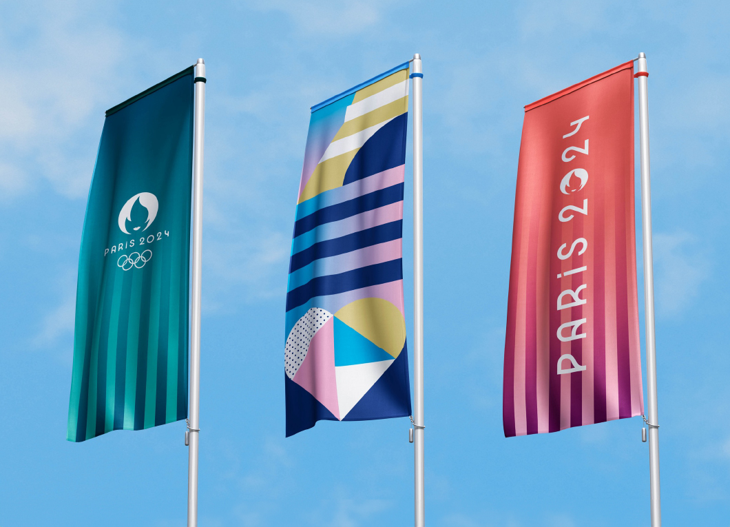
A once-in-a-lifetime opportunity to brand the Paris 2024 Olympics and Paralympics represented a once-in-a-lifetime opportunity to honour the heritage of the 1924 French Games and propel Paris and the spirit of Olympism into the 21st century. This was about leveraging the idea of what defines Paris and France while also breaking free from it to create something unprecedented – a grand spectacle. And all while prioritising the legacy of the Games and their environmental impact.
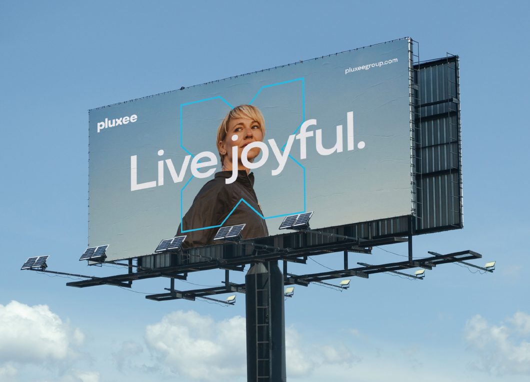
Following a strategic decision to move away from parent company Sodexo Group, Pluxee needed a global brand to support its growth ambitions and reframe and elevate its proposition. With a strong track record in employee engagement, the business was operating in an increasingly competitive and crowded market. But the category was awash with the same visual codes and messaging, and the opportunity for differentiation was immense. To create a brand that felt distinct and differentiated, we crafted a new positioning that focused on opening up a world of opportunities to help people enjoy more of what really matters in their lives, and designed a brand that's both joyful and dynamic.
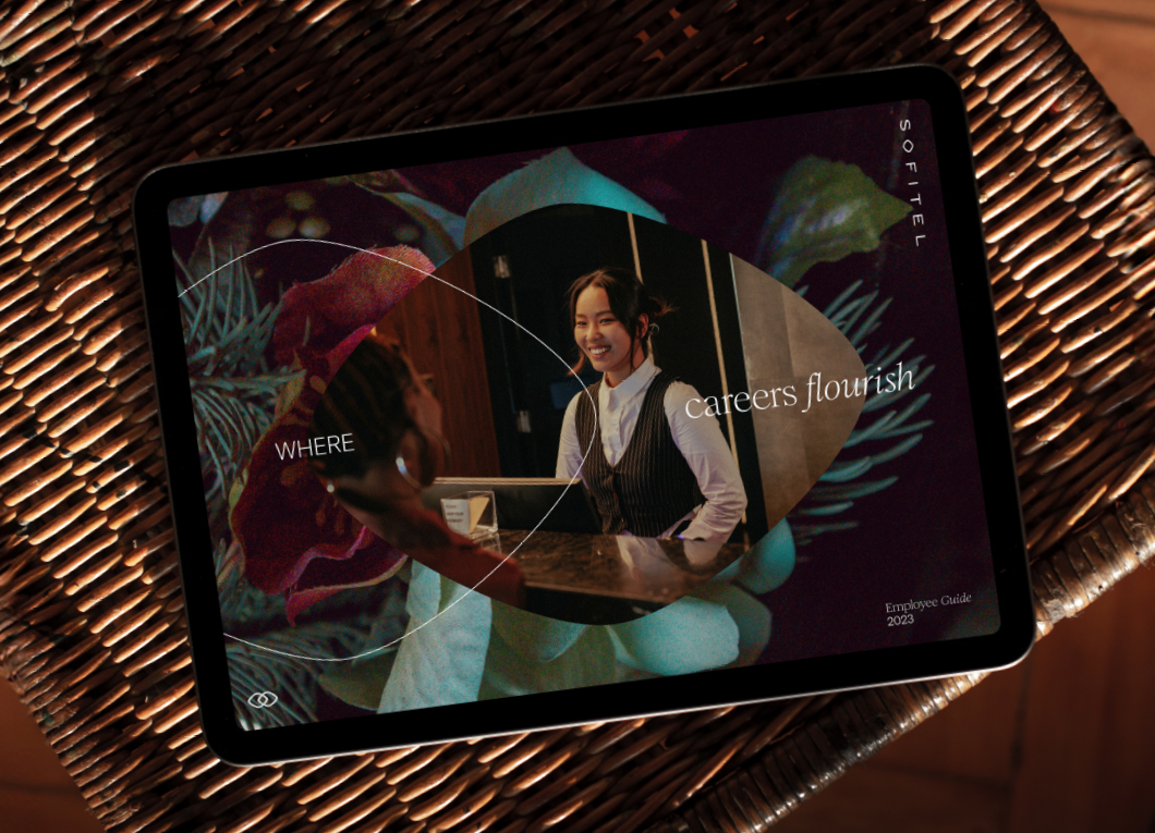
With the luxury travel sector under serious scrutiny, luxury brands are having to redefine what they stand for. Luxury travel can no longer be wasteful or superficial; instead, it’s about rejuvenation and reconnection for travellers who value meaningful social experiences over destination alone.Our challenge was to elevate Sofitel from a global leader in hospitality to a French luxury lifestyle ambassador. We needed to reinforce its luxury credentials, broaden its customer base, and put French-ness at the heart of its iconic brand.
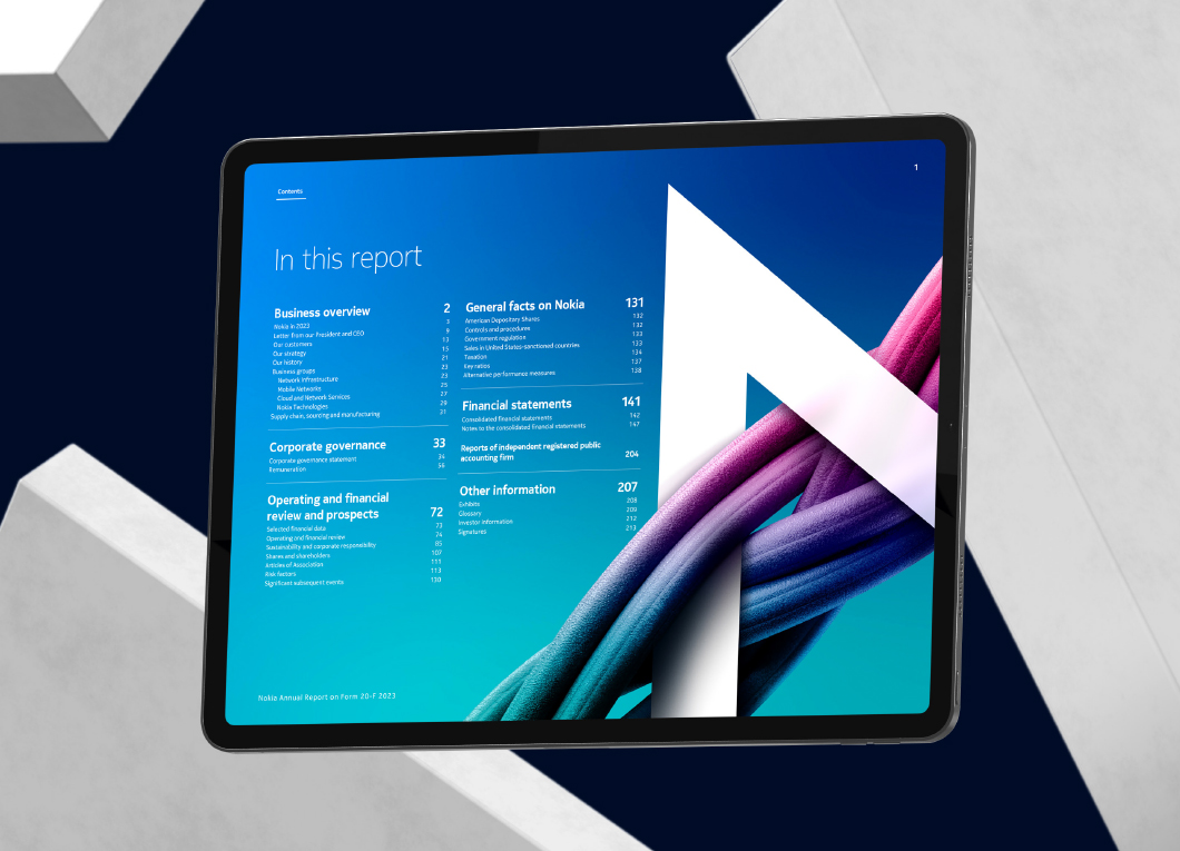
Finnish technology brand Nokia has a fresh visual identity, strong digital presence and a bold strategy to share with its stakeholders. And its 2023 reporting suite (annual report on Form 20-F and Finnish and English language reports) was the perfect vehicle for communicating this. As well as aligning with Nokia’s strategic direction, the 2023 annual report needed to make the switch to a digital-first format and showcase the Group’s performance. To present Nokia’s strategy in the most compelling way possible, we developed a vibrant, on-brand experience.